If you haven’t engaged a interior designer to assist with your selections and need to make timely decisions for the planning stage or the ordering process, here are a couple of considerations to make before selecting colours and textile design.
Colour harmonies that are on song
There is no such thing as a bad colour, only bad colour relationships. Colour psychology plays an important role in the finishing of interior and here are some techniques you may like to consider. They are Analogous, Monochromatic, Achromatic & Complimentary colour sets.
Achromatic colours harmonies have low saturation, therefore utilise white, black & greys. This scheme is classic, timeless and gives you freedom to change the theme easily by adding accent colours, through coloured throw cushions, floral arrangements, linen, tea towels, etc. You can also add interest by selecting patterns and designs, which I have covered in the second part of this blog.

Monochromatic colours are tints, shades and gradients of one colour. This is usually used if you would like to make the room more of a backdrop to make the views or furniture more prominent and promote the inherent mood (e.g blue for a beach house, pink for a girls room) You can add interest through patterns, designs and unique furniture items.
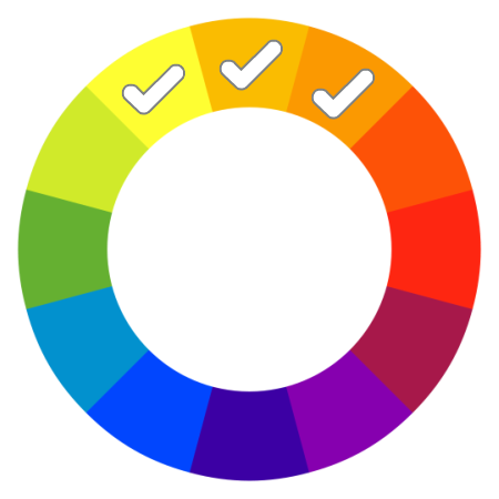
Analogous colours are any three colours which are side by side on the colour wheel. One colour is the dominant, and the other two will support the scheme. This scheme is similar to the Monochromatic but offers more colour variation. The addition of neutrals and adding some low key shades (pastel versions) of the selected colours will aid in achieving balance.

Complementary are colour schemes which are opposite to each other on the colour wheel. They are rich vibrant lively themes that directly contrast each other. It is preferable to have one colour dominating and the others serve as subdued accents.
Upon finalisation of your colour selections, order small paint samples from your nearest manufacturer, we use Taubmans. Apply a couple of coats to an A4 piece of paper and place it on a wall at different times of the day. Observe how it looks during the day and night (under your lighting) to gain confidence that is the look you are trying to achieve.
Patterns. Mix & match
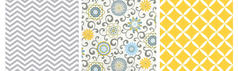
Patterns can refer to history, culture, nature and geometry. One trick to mixing patterns is to have one organic, one geometric and one as a different sizing scale as either geometric or organic. Examples of organic are usually inspired by nature, floral and are a bit more abstract. Geometric have patterns, repetition and can sometimes look contrasting.
Fabric application
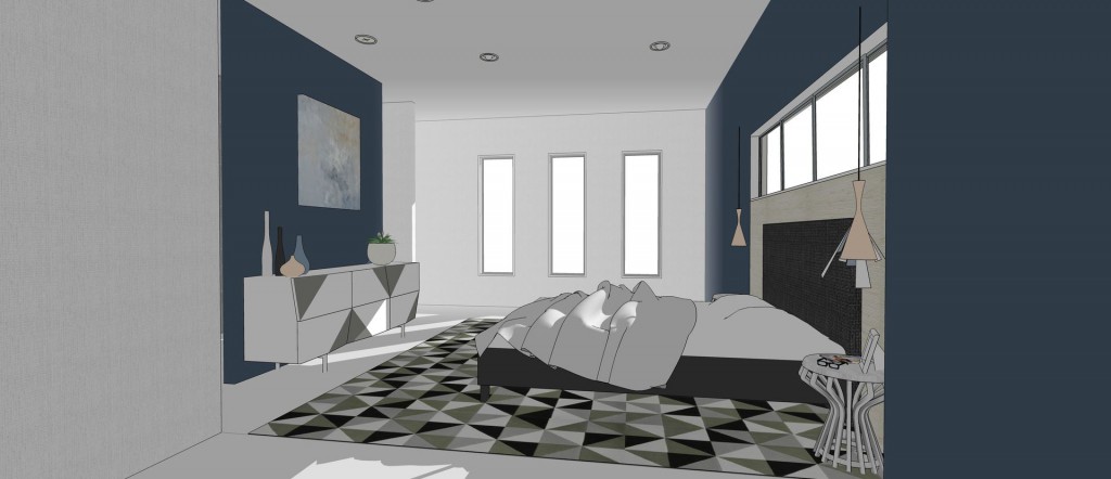
When selecting textiles and fabrics, you may like to consider the use of the 60:30:10 rule. Select three of your favourite patterns and assign them as accordingly. Allocate your favourite pattern to 60% of material (e.g wallpaper, rugs or curtains), your secondary choice to 30% (e.g cushions, artwork, sofa throw rugs) and then the final 10% to the remainder of the material (e.g smaller cushions, lampshade print, table runners). You may want to consider solid colours if the room feels overwhelming.
Remember my suggestions above are only guidelines and rules can be broken to ensure that your interior design achieves a harmonious space.
I hope the information above was helpful and would love to hear any feedback.
Leave a Reply
You must be logged in to post a comment.